Case study
ReEmployME
Role
UX Researcher & Designer
Type
Solo passion project
When
December 2020
Timeline
6-week sprint
Methods
Tools
the problem
"Clunky" navigation, government jargon, and poor communication leave ReEmployME users frustrated and confused.
"It seems like such a cheap, poorly constructed site that it doesn't feel safe. There is so much riding on this site for people's well being, that it doesn't feel like a safe way to cover your livelihood."
Outcome
As a result of mixed-method research and design iterations, I was able to:
- Increase success rates for key tasks
- Simplify information architecture
- Design a UI that is both modern and fitting of a government website
-
ReEmployME is part of a larger User Interface (UI) system called ReEmployUSA (also includes Mississippi, Rhode Island, and Connecticut) meant to “reduce the frequency and cost of failure.” Since its launch in 2017, however, Maine has had troubles, including system bugs, user complaints, and allegations “leadership… ordered that hundreds of requests for help from claimants be destroyed.”
As of 2020, unemployment systems throughout the country were strained by the surge in unemployment cases resulting from the pandemic, and Maine was no exception. Between March 15 and April 25 2020, 15% of the state’s workforce filed for unemployment. According to an article from the Bangor Daily News,“Members of the Legislature’s labor committee raised concerns about workers’ inability to contact the department by phone, as well as issues with the design of the state’s website and the agency’s pace of implementing new federal programs, while a Republican lawmaker took it upon herself to get a rough quote from Google to replace the state system entirely.”
RESEARCH
Current State Analysis
At first glance, there are several UI issues.
1. News & Announcements
The red text, which is meant to grab the user's attention, is difficult to read.
2. Main Menu
It is not clear from the labels on the tabs what the user will find under each tab. The black carrots indicating drop downs are difficult to see against the blue tabs. Some of the drop downs are unnecessary.
3. Claim Status Tabs
The Weekly Certification Status tab overlaps with the Claim Information tab even though there is ample space available below.
4. Quick Links
The Quick Links menu may be more visually appealing, but it is no quicker than the menu of tabs along the top. The categories and subcategories are identical.

User Research
I conducted a survey, which I posted on the Facebook group “Unemployment Maine Information and Help”. The survey helped uncover unrealized user types and receive unbiased information, as I did not know the participants’ identities.
User interviews helped me dig deeper into the current user experience. I asked users to rate their state’s site from 1 (false) to 5 (true) on key metrics.
-
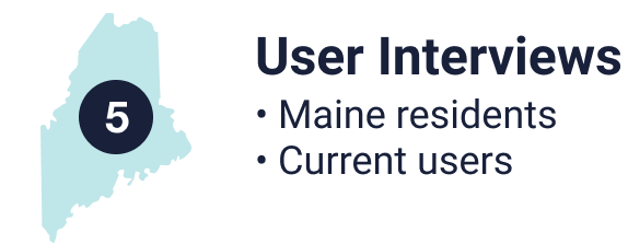
I interviewed 5 Maine residents who were currently receiving unemployment benefits or had used the site within the past 6 months.
-
I interviewed residents from other states who were currently receiving unemployment benefits or had used their states' sites within the past 6 months. I asked them questions about their own sites and asked them to perform key tasks within ReEmployME while I noted their pain points. The goal was to understand the current state of other states' sites as well as see if new users were able to complete the key tasks successfully. <b>Not a single user was successfully able to complete the given tasks without giving up or asking for help.

According to these results, other states have room for improvement, but Maine scored significantly lower. With this in mind, I gathered feedback from interviews and found trends using affinity mapping.
A Closer Look: The Menu

A separate tab, “Update Address,” has identical content to the “Contact Details” option. Alternately, a tab labeled “Account” or “Profile” could would better describe the contents of this tab.
SYNTHESIS
Affinity Mapping
I grouped users' comments into four major pain points:
-
1. Communication
• Users are often unaware when a message is waiting for them in their accounts
• The DOL is inconsistent in the modes of communication it uses
• The DOL's contact information is difficult to find
• Users can not get through to a live person when they call the phone number listed
• Users do not know if their e-mails have been received or tasks have been completed
2. Functionality/Navigation
• Users are concerned that the site is not accessible for non-native English speakers or those inexperienced with technology
• Users called the tabs in the menu useless, inefficient, redundant, meaningless, complicated, and unclear and complained the tabs require multiple unnecesary clicks
• Red text, meant to draw users' attention, is difficult to read
• Quick Links are not actually any faster than the main menu
• Users want Calls to Action (CTAs) such as "Certify Claim"
3. User Interface (UI)
• Looks "cluttered," "clunky," and "confusing"
• Needs more images to balance out text
• Highly contrasting colors are difficult to look at
• "If it was too much in the other direction, I would wonder if I'm on the right site."
4. Terminology/Content
• The website uses government jargon and other vocabulary that users are not familiar with
• Instructions should be listed in steps or bullets
• "Just the way it's organized with so many words — It's kind of like walking into a business with so many signs everywhere. No one is going to read them.
• Red text draws the user's attention but is difficult to read
BTW…
Having had personal experience on the ReEmployME, there were topics I expected to be issues that did not come up in interviews or turned out to be non-issues. I therefore did not address them in my re-design.
-
Length of waiting period for a claim to be approved — Users recalled their claims taking one to three weeks to be approved and thought that was a reasonable amount of time.
Amount of time it takes to fill out a weekly certification — Most users reported spending under five minutes each week filling out their weekly certifications.
Requirement to perform job search-related activities — Users thought it was reasonable for the state to require users to perform job-search related activities and that the activities themselves were achievable.
Concerns about Covid-19 keeping users from working
User Personas
Before determining which opportunities to address in this sprint, it was important to understand the users and their needs.
The challenge here was designing a site that met both users needs.
-
Ultimately, form follows function on a website responsible for providing income to the unemployed. I chose to include a UI redesign of ReEmployME in my scope but prioritized UX and functionality over the UI. That is not to say one user's needs are more important than the other's, but I chose to continually check in with my research during the design process to make sure that all visual design decisions were in fact based on research and added to the functionality of the site instead of detracting from it.
Prioritization and the MoSCoW Method
Redesigning a state’s unemployment site is a big undertaking, and it would be easy to fall prey to scope creep. I used the MoSCoW method, which prioritizes elements of a project by what must, should, could, and won’t be done, to determine what would fall within the scope of this project while considering the time and resources available.

Must:
Make the site more accessible — Include links to aid for hard of hearing, ESL, and those without access to technology
Make DOL’s contact information easy to find
Simplify navigation
Make notifications/announcements easier to read
Make messages from DOL easier to find/ add notice of new messages

Should:
Include link to user guide
Organize footer

Could:
Re-write weekly certification questions (I decided I needed participation from the DOL to undertake this and therefore included it in future recommendations.)
Add new user onboarding (To be included in future recommendations.)

Won’t:
Design new green and blue logo — Because ReEmployME is part of a larger ReEmployUSA, I held off on this for now.
Address Employer Services — As a claimant, I only had access to Claimant Services. If this redesign is well received, I would be thrilled to extend the design to Employer Services in the future.
Anything that required increased recourses, such as text message alerts, a chat function (allowing users to message with DOL personal live), and general improving speed of communication with the DOL fell out of scope.
And so…
THE PROBLEM
Maine residents on unemployment need a website with information that is organized and accessible so that they can easily complete key tasks and find important account information.
THOSE KEY TASKS ARE:
File weekly certification
View claim/payment history
View status of claim and understand any issues
View communication from DOL
Communicate with the DOL
WE WILL KNOW THIS TO BE TRUE WHEN:
Users successfully complete tasks during testing without help or giving up
User feedback rates between 4 and 5 for usability/positive experience
Key functions are visible on home page
THE SOLUTION
By organizing content in a way that prioritizes key functions and emphasizes accessibility, users will be able to easily navigate the site and successfully complete vital tasks.
HOW MIGHT WE…
Ensure users can complete key tasks?
Prioritize key features and tasks?
Minimize unnecessary stress from the experience of using ReEmployMe?
Make the website accessible for users who are
Not experienced with technology?
Not fluent in English?
Visually impaired?
DESIGN
1. Determine design requirements
Before I started designing the solution, I looked back at my research and came up with a list of requirements the design would need to fulfill.
A balance of visuals and text
Pictures/symbols for people who are not strong readers or fluent English speakers
Clean but not sterile
Not too fluffy, needs to look like an official government site
Instructions/steps should be listed in bullet points
Wording is clear. Doesn’t use government jargon or figures of speech
2. Sketch
The landing page needed to be simple and impactful, allowing the user to find important information about their account and complete key tasks easily.
-
I chose to follow the F pattern, which assumes that the user reads from left to right and the eye instinctively starts down the left side of the screen and then across to the right.
The user needs to quickly see if there is new information about the account, so I placed announcements along the left of the screen.
Next, the user’s eyes move to the right and sees the main menu. Here users can choose between 4 to 5 menu options instead of the current 9. All of the same tasks and information are still available, but organized and labeled according to users’ feedback.
3. Create wireframes in Figma
4. Set expectations of government sites
-
One of the design requirements was that the site be clean but not sterile. As one user put it, “It is a government site, so it’s very sterile. It feels very official… I at least trust it because of that… If it was too much in the other direction, I would wonder if I’m on the right site.”
I didn’t want users thinking they were in the wrong place. The challenge was to elevate the design of a government website without going too far in the other direction and distracting from the content. I studied the good, the bad, and the ugly of government sites to understand users’ current expectations.
5. Find inspiration from Maine businesses
Like many logos and websites stemming from Maine, my design was inspired by the great outdoors. I knew I had to include blues and greens in the color palette, reflecting the forrest and the ocean, and I even used a photograph I took myself of a lighthouse near my home.
PROTOTYPE

With only four menu options, the home page is an easy jumping off point for the five key tasks. Helpful resources are grouped together, and news & announcements are easy to read — no more red text!

The ““Claim Status” page consolidates information about the user’s claim into one spot.

Questions are differentiated by alternating gray and white backgrounds to make it easier to select the correct answer for each question.

Users expect to see “Messages” in the upper right corner with Login and Home. I delivered, along with a red alert when a new message is waiting.
Usability Testing
For each design, including the current state, users were asked to complete key tasks and rate the site on navigation, look, ease of communication, and ease of contact. The keys tasks were:
File weekly certification
View claim/payment history
View status of claim and understand any issues
View communication from DOL
Communicate with the DOL
Current State
-
1. Even though there was a tab “Weekly Certification,” many testers first chose the “Unemployment claim” tab next to it. After initial confusion, testers were able to file a weekly certification successfully.
2. Would you think your claim history could be found under “Inquiry”? Neither did the testers. 100% of testers gave up or asked for help.
3. Testers quickly saw the weekly certification status window on the home page. Finding more information on their account, however, was trickier. Testers knew they could find their claim history under “Inquiry,” but they did not realize an explanation of issues could be found by following a link at the bottom of the page called “Unemployment Verification.”
4. Some found the “Correspondences” tab right away, while others were unfamiliar with the term. The term “messages” was suggested instead. One user from Maine had noted that she often goes weeks or months without knowing she has a message from the DOL, because she forgets to check this tab. She requested a notification that a message is waiting.
5. Testers could not find contact information for the DOL on the site because it is not there. The email button in the footer gave users the option to sign up for email updates from the DOL, but it did not allow users to send emails to the DOL. To find contact information, the user had to leave the site, and even then, there was not a central page containing options of how to contact the DOL.
Low Fidelity Prototype
-
1. The “File Weekly Certification” CTA under Quick Links made the first task easy to complete. When using the main menu, testers chose either “My Claim” or “My Profile.”
2. Testers quickly found their claim history under “My Claim” in the main menu.
3. “Claim Status” in the Quick Links brought testers to the weekly claim status. They could also find their claim status under “My Claim.”
4. Users could easily see where to find messages from the DOL in the “Messages” tab in the main menu.
5. A “Contact Us” page under the “Help” tab will provide a thorough list of contact information for the DOL.
6. Creating the tabs “Help” and “My Profile” reduced the number of tabs from 9 to 5.
7. Announcements remained on the left side of the screen, as they contain important information for users to read. However, the text changed to black in order to make it easier to read, and the heading staid red to draw attention.
8. A new resources section provided links to external sites found on maine.gov. Users said that these would be helpful but did not know that they already exist or did not know where to find them. Now, they are all in one place in order to make the experience of being unemployed as seamless as possible.
Design #1

-
• The UI design was a bit of a process. I wanted to include a picture of Maine as well as the colors blue and green because of my research, but my first draft lacked green and fell flat.
• In the previous round of testing, one tester felt the main menu was simple enough that five quick links were not necessary. Because of this, I removed Quick Links and kept only the two most important CTA’s.
• “Report Fraud” and “File Appeal” were moved from the “My Account” tab to the “Help” tab, which helped to raise the navigation rating up to 4.5.
Design #2
-
1. “File Weekly Certification” was now found in both a dark green CTA and under “My Claim" in the main menu.
2. Users expressed that initial confusion surrounding navigation was easily resolved and that the site is easily learnable. Still, some confusion remained around the terms “My Claim” versus “My Profile.” Users were split between whether or not to change “Profile” to “Account.” I would like to continue testing in this area.
3. A “Claim Status” page, found under “My Claim,” provided testers not only their claim’s weekly status but also comprehensive information about the account, including information on any issues.
4. In this iteration, “Messages” was moved from the main menu up to the top right corner of the screen near “Log Out” and “Home, per testers’ requests. If a new message was waiting to be read, the user was notified by a red alert icon. Now there were only 4 tabs in the main menu.
5. Though it was not built out yet, testers went straight to “Help” to find the DOL’s contact information.
6.The final design included dark green CTA’s and a lighter green bar under the main menu. These, along with two shades of more saturated blue helped the new design pop.
7. The new design scored either 4.5 or 5 out of 5 in all four categories, a big improvement over the current state.
Site Map
To understand just how much the structure of the site has changed, take a look at the site map before and after the redesign. The main menu led to link after link after link, and information was spread between nine tabs. Now, there are are fewer layers in the information architecture, and information is consolidated in fewer menu tabs. (Select images to expand.)
What Comes Next?
I am excited by the improvements that my redesign brought to ReEmployME, but there is so much more to be done. Much of this work requires buy-in from the DOL; with their help, I would proceed with the following:
-
Continue testing the best terminology for the user’s account, whether that be “Account”, “Profile”, or something else.
Re-write weekly certification questions - I do not currently have access to all of the questions in the various weekly forms. I would also need to deepen my familiarity with the questions themselves and what they are trying to convey.
Add new user onboarding - A step-by-step tutorial could help new users through the stress of setting up a new account.
Continue to organize footer - Many of the links in the current footer do not work, and many just don’t belong. They add clutter to a site that needs the space for more valuable resources that it currently lacks. I would like to get input from the DOL on what is needed here.
Design new green and blue logo - Because ReEmployME is part of a larger ReEmployUSA, I held off on this for now.
Address Employer Services — As a claimant, I only had access to Claimant Services. If this redesign is well received, I would be thrilled to extend the design to Employer Services in the future.
TL;DR
“Maine-ahs” are very proud of their home, and I wanted to design a website that reflected them and that they would be proud to use. Just because it is a government site does not mean it needs to look dated. I tried to elevate the UI of a government site while remaining professional, and I feel I was successful.
Users thought I was successful as well. On a scale of 1 to 5 (1 = bad, 5 = good) users gave the current site a 1.85 on looks and a 2.25 on navigation. My new design received a 5 on looks and a 4.5 on navigation.
This was my first project after my time at General Assembly, and I thrived on the opportunity to choose a topic I was passionate about and to set my own schedule. In six weeks, I researched a complicated industry, interviewed users with real and valid frustrations, made design decisions that I could justify by research, and ironed out pain points through usability testing. During this time, I saw my skills in Figma grow and my eye for design strengthen. This project deepened my passion for UX and justified my pursuit of this career. Now for my next project!